

LINDEN TREE CARE
BRANDING & WEBSITE DESIGN
Logo / Branding / Web Design / Print Materials
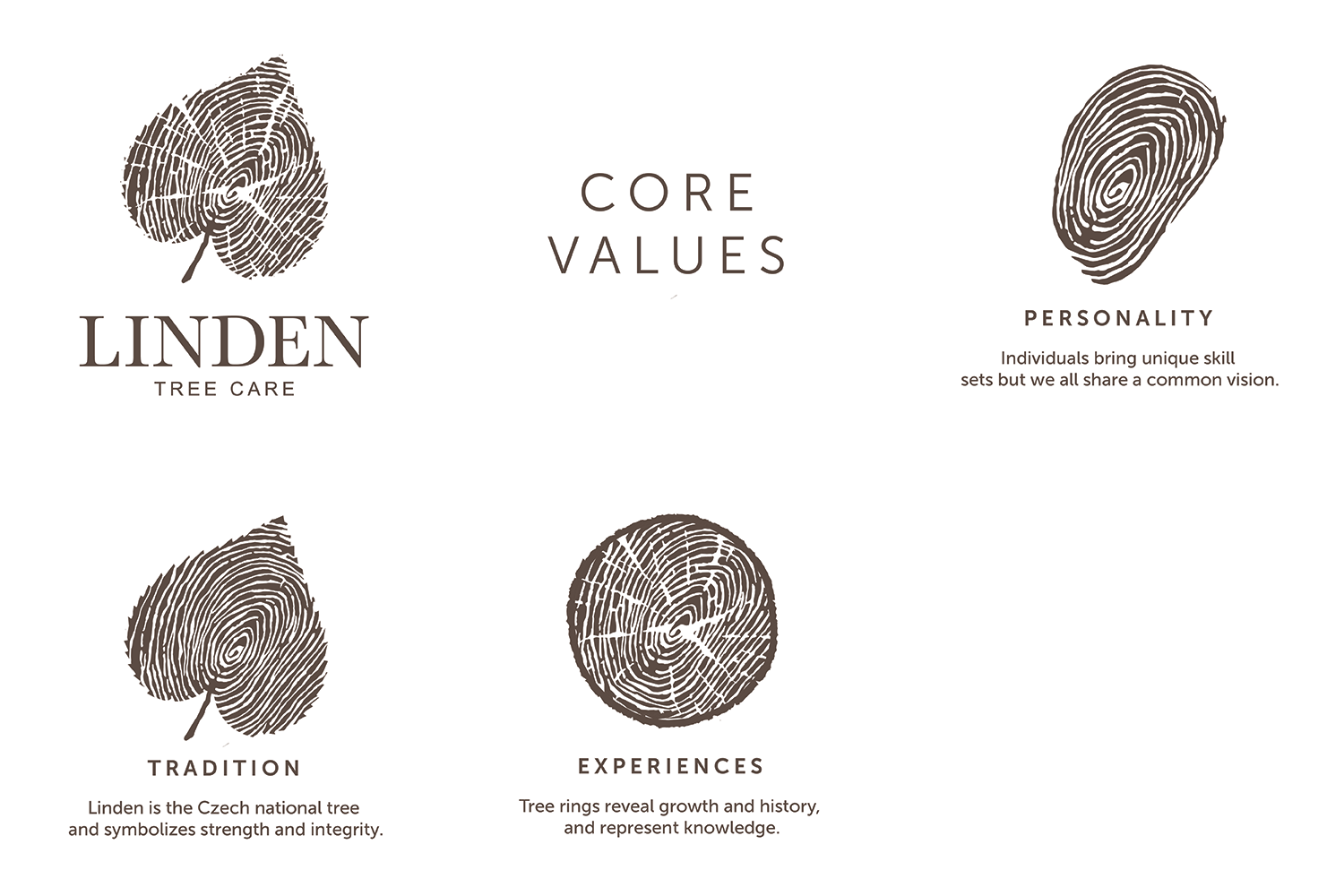
We developed a meaningful and nature-inspired brand identity for Linden Tree Care, built around the company’s three core values: personality, tradition, and experience. The logo combines several symbolic elements to create a unique and memorable visual identity connected to both nature and the founder’s roots.
A fingerprint pattern represents individuality and personal service, while the linden leaf symbolizes tradition and connection to the Czech Republic, where the company founder originates from. Annual tree rings were incorporated to represent growth, experience, knowledge, and the history developed over time. The natural heart shape of the linden leaf also reflects passion and care for trees and the environment.
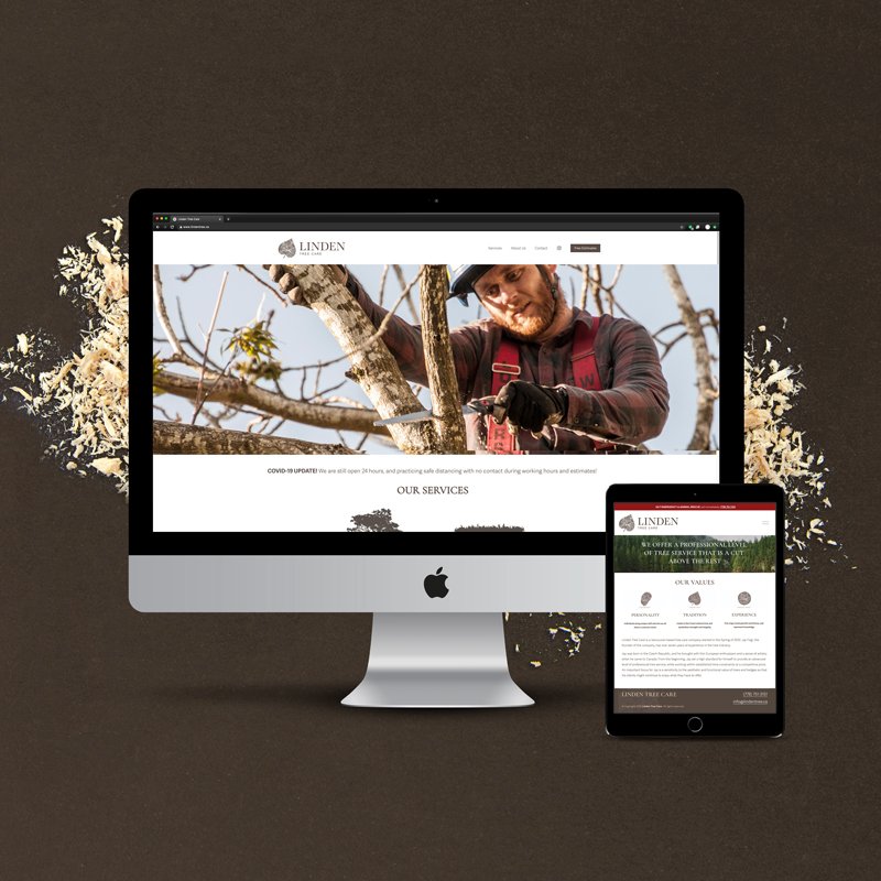
The branding uses warm brown tones to create a grounded, trustworthy, and organic visual language that strengthens the connection between nature, the company, and its clients. Alongside the logo and print materials, we designed a modern website focused on clarity, professionalism, and strong visual storytelling.
VISIT THE WEBSITE: www.lindentree.ca



“We would highly recommend Lucie Dedkova. She is great to work with and she is very professional and knowledgeable. Lucie is fast, has simple good ideas and suggestions. We love our company logo and website.”


HAVE A PROJECT IN MIND?
We treat our clients like they're a part of the family, when we say you’ll have our full attention, we mean it!