WHAT MAKES A GOOD LOGO? 5 Rules for a timeless Vancouver brand identity
Your logo is often the very first interaction a potential client has with your business.
In a competitive local market like the Lower Mainland, a generic template or a poorly executed mark can make an elite company look amateurish.
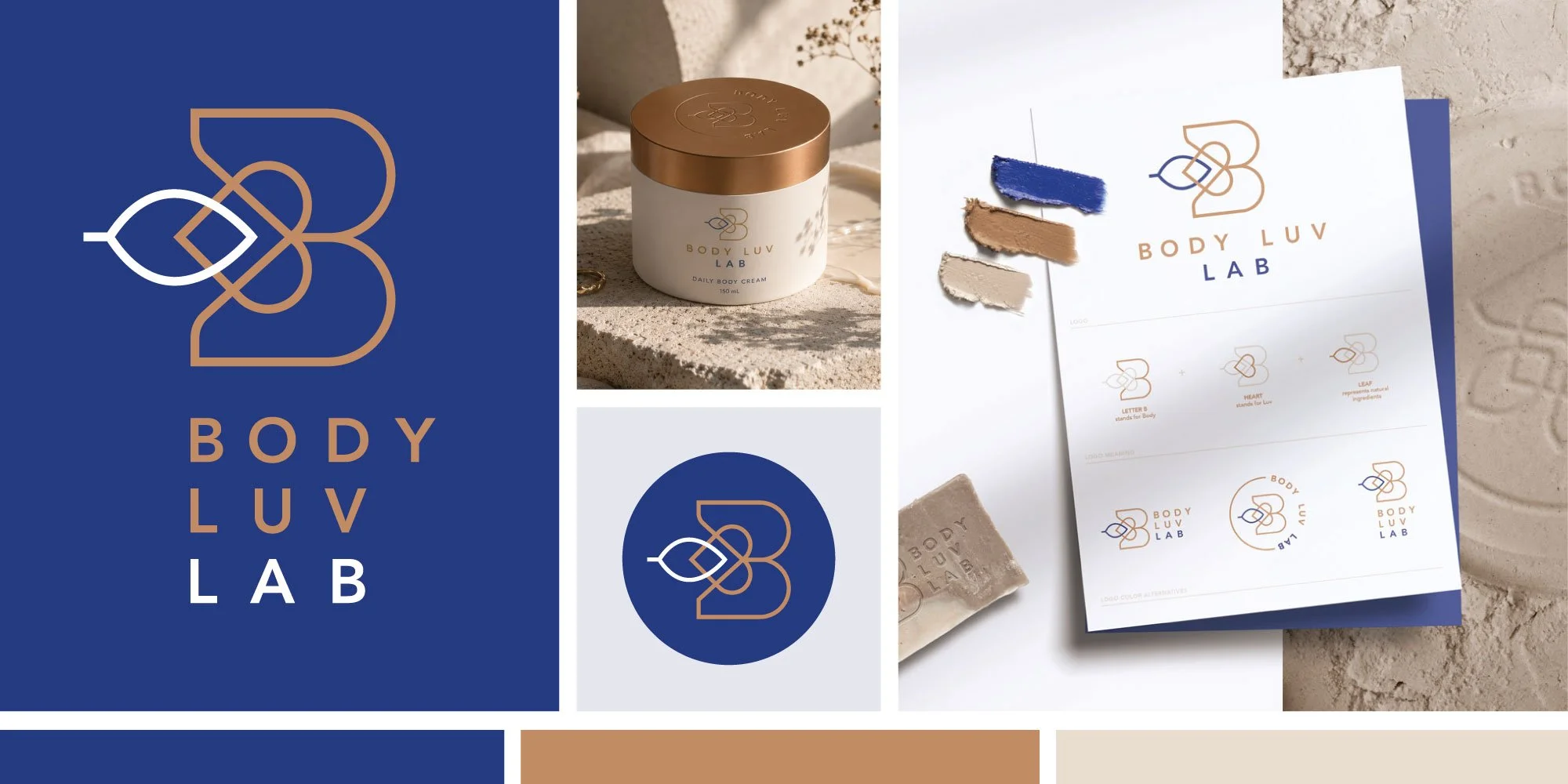
Logo design and branding for a Vancouver beauty business designed by Lucied Branding & Web Design Studio.
Conversely, a great logo instantly conveys premium quality, builds immediate trust, and sets the tone for your entire Vancouver brand experience.
But what actually separates a DIY shortcut from a world-class mark? Truly exceptional brand assets aren't just pretty shapes. They follow strict strategic guidelines.
Whether you are launching a new venture or planning a comprehensive brand evolution, here are the five essential rules that define a highly effective, professional logo for any growing Vancouver business.
1. SIMPLICITY
The most common mistake businesses make is trying to tell their entire life story in a single tiny icon.
When a logo is cluttered with too many gradients, intricate illustrations, or multiple fonts, it becomes chaotic and impossible for a busy Vancouver consumer to remember.
Think of the world’s most iconic brands: a single swoosh, an apple with a bite taken out of it, or a minimalist typographic monogram. A great Vancouver logo design strips away the noise and focuses on one memorable concept. Simple designs are clean, modern, and dramatically easier for a customer's brain to recognize and recall in a split second.
2. SCALABILITY
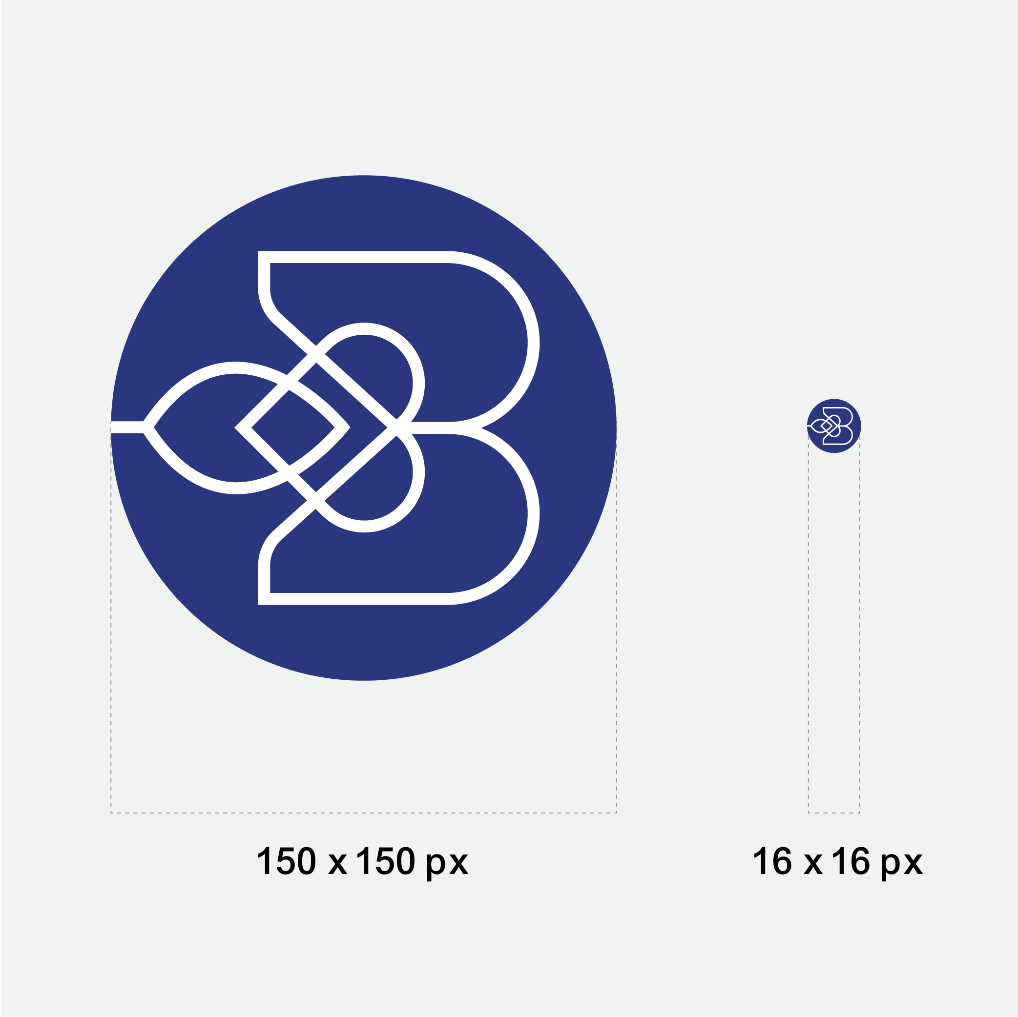
A beautiful logo is completely useless if it turns into a blurry, unreadable smudge when scaled down. In modern local business, your visual mark needs to perform flawlessly across completely different environments, both digital and physical.
Before finalizing a layout, a professional Vancouver branding studio will always put the asset through a scalability test. Does it look stunning and crisp on a massive highway billboard or a commercial vehicle wrap? More importantly, is it perfectly legible as a tiny 16 x 16 pixel favicon in a web browser tab, a social media profile picture, or embroidered onto local team apparel? If the details get lost on a smartphone screen, the layout needs to be simplified.
3. MEMORABILITY
A great logo shouldn't look like everyone else in your local industry. If you run a construction company in BC and your icon is a generic house roof, or if you run a local dental practice and your icon is a literal tooth, you will immediately blend into a crowded sea of competitors.
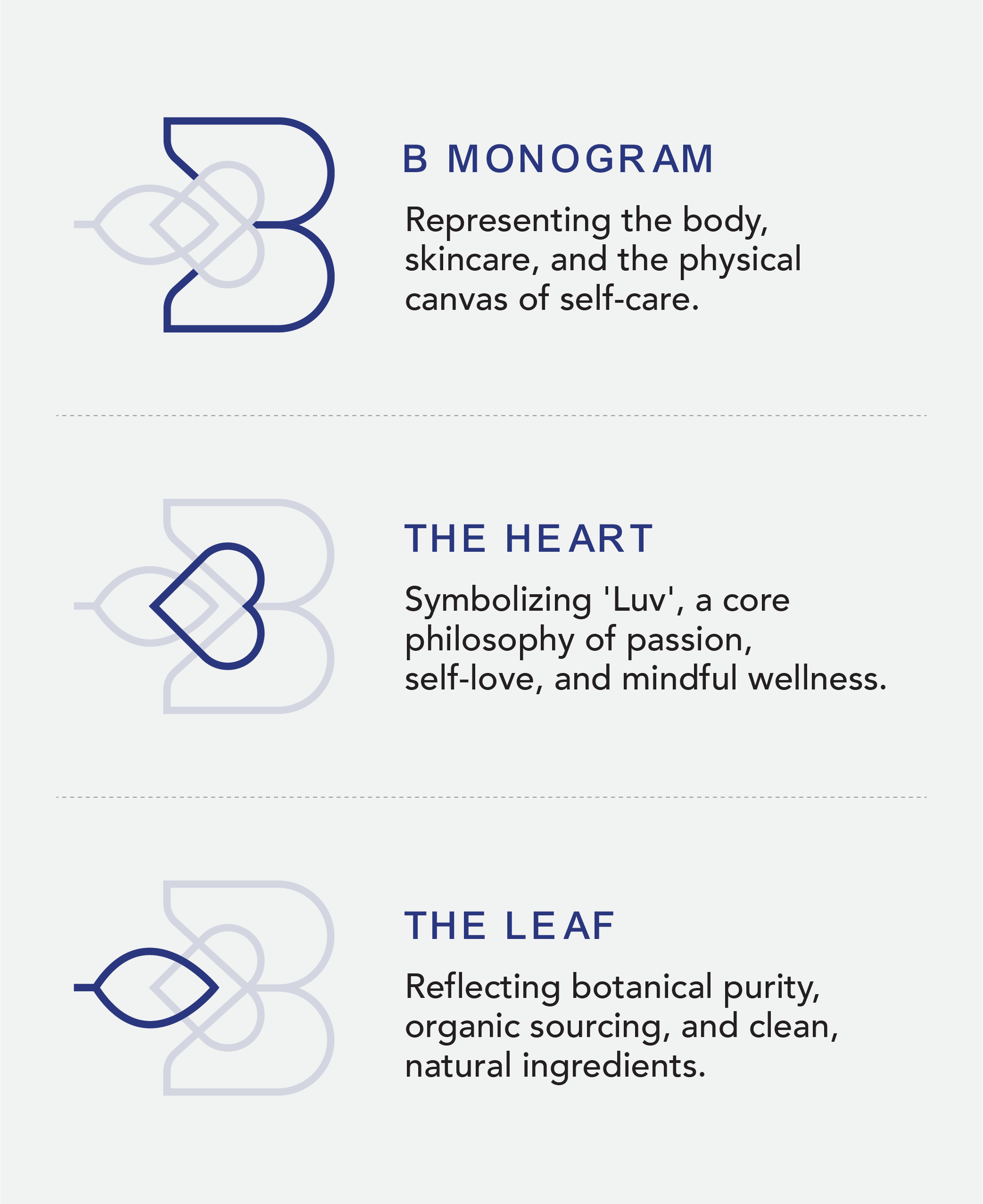
To stand out in the busy Vancouver business landscape, a mark needs a subtle, clever hook.
This could be an unexpected geometric interaction, a brilliant use of negative space, or custom typography that belongs entirely to you. Aim for a visual identity that feels familiar yet entirely distinct, capturing the unique spirit of your company without leaning on boring, overused clichés.
4. VERSATILITY
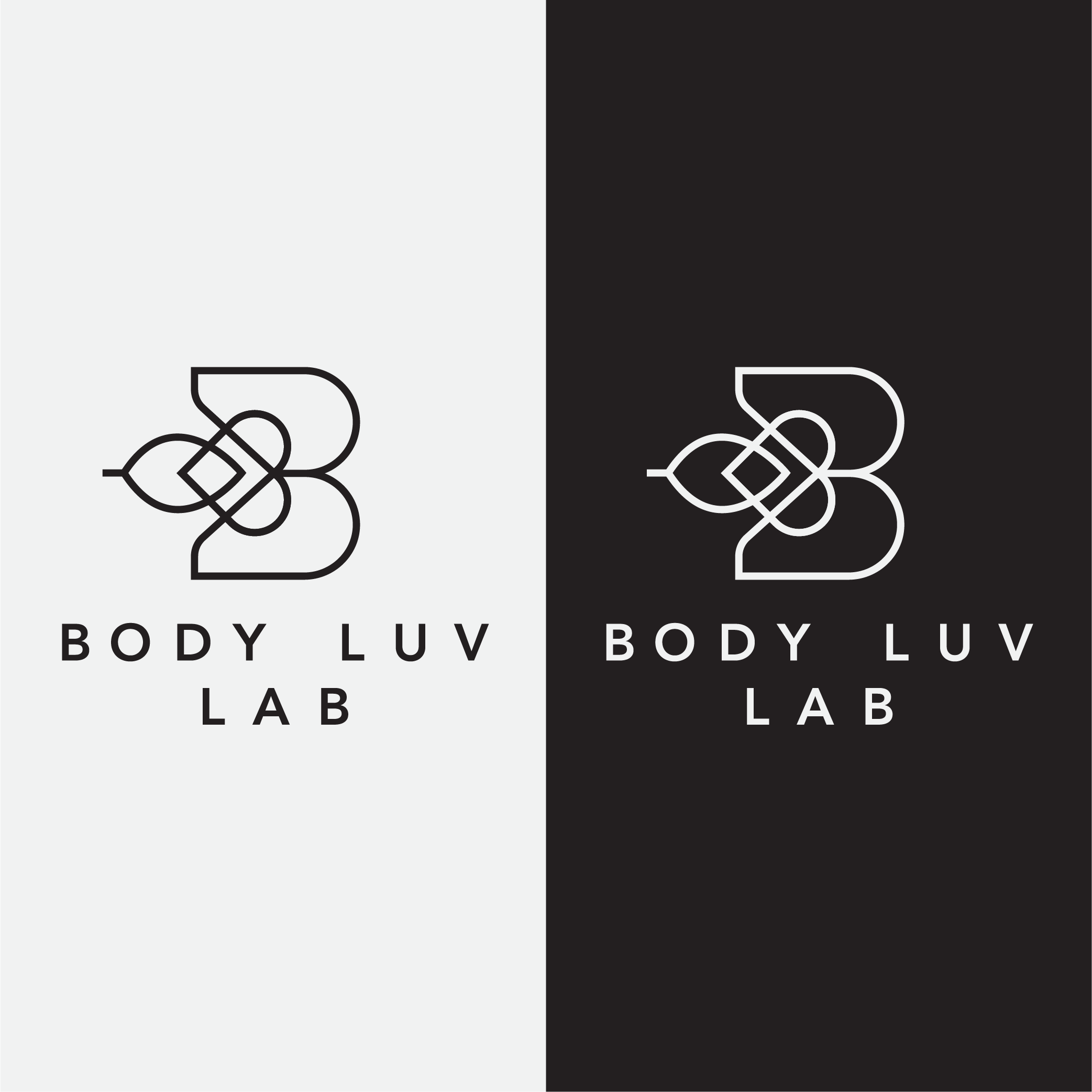
THE B&W TEST
Colour is incredibly emotional and a vital asset to your narrative, but a strong Vancouver logo design should never rely entirely on colour to make sense.
True versatility means your mark can be stripped of its colour palette and still remain completely recognizable. Always design and evaluate your concepts in pure black and white first. If the shapes lose their impact or the text becomes unreadable without gradients or specific shades, the core foundation of the layout is weak. A versatile design can be stamped in gold foil, embossed on heavy business cards, or printed in single-colour ink on a shipping box while keeping 100% of its visual authority.
5. RELEVANCE AND LONGEVITY
A professional logo should be built to last for decades, not months. It is incredibly easy to get caught up in fleeting, hyper-specific graphic design trends, like neon cyberpunk gradients or trendy retro badges, but these styles often look incredibly dated within a few years.
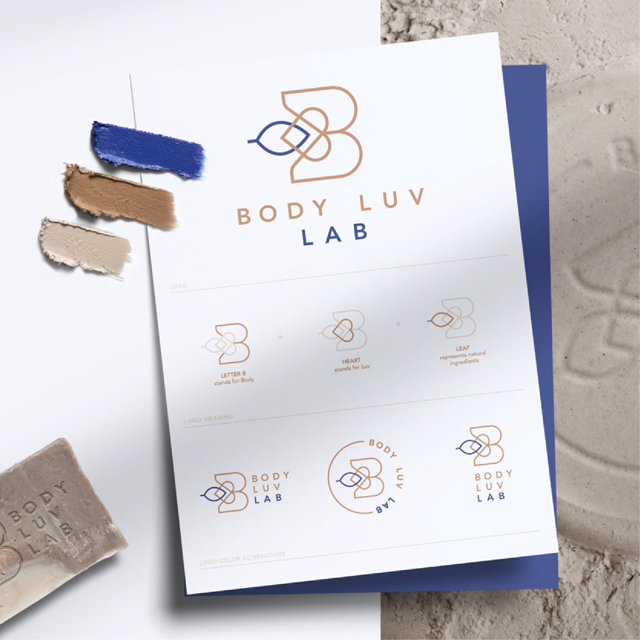
Your brand assets need to be deeply relevant to your specific target demographic while remaining completely timeless. Prioritize balanced geometry, classic typography, and deliberate shapes that will ensure your Vancouver brand identity feels just as premium, elegant, and relevant ten years from now as it does today.

LET’S ELEVATE YOUR VANCOUVER BRAND IDENTITY
A truly great logo doesn't happen by accident. It requires a deep dive into your business goals and your target audience.
At LUCIED Branding & Web Design Studio, we craft intentional, premium visual identities engineered to help your Vancouver business stand out, command higher rates, and build lasting credibility.
Ready to transform your brand from generic to elite?